
Renoviso
Renoviso Help Me Choose: Windows Aren't Glasses
Renoviso had been designed for one product. It had evolved into 69 unguided options, and fewer than 10% of visitors ever got past their first click. I inherited two earlier attempts to fix it, each of which had already failed.
- Needed something beyond a traditional conversion funnel
- Studied how industry leaders outside home improvement solved the same kind of problem, then followed their playbook; the results were underwhelming
- Dug into why we were failing, and what made our own market different
- Rebuilt around the two decisions that mattered most to our audience, both anchored to their budget
- Customization completion up 50%+, checkout conversion up 10%. I still wasn't happy. Six more months of testing added another 36% on top of that.
Windows aren't glasses

The live Windows category page: 69 unguided options with no way to know what any of it would cost.
Renoviso started as a single line of windows. One product, one configuration path, easy to price. By the time I joined, that had grown into 69 different windows across five brands, three material types, and ten styles. The category page still worked like there was only one option. A customer could choose one from 69 unguided options before they had any idea what it would cost them.
Less than 10% of all visitors to that page ever selected and customized a window. Everyone else bounced around: selecting one, going back, selecting another, never customizing. We called it price hopping. They were looking for a way in that didn't exist.
This wasn't a new problem, and it wasn't for lack of trying. Two earlier attempts to fix it had already failed: one from a freelance designer, one from a group of MBA students the company had a relationship with. Both were flawed on the UX side; neither could actually be built on the technical side. I inherited a problem other people had already tried and failed to solve.
What we needed to be true
The goal was conversion, in three specific ways: more users starting product customization, more users configuring something that actually fit their project budget, and no drop in the rate of people submitting a project for approval and sharing contact information for sales. There was one hard constraint from day one: whatever we built had to run on the existing backend. No re-architecture.
Empathize: The Research
A year earlier, I'd run a company-wide workshop mapping every stage of a home renovation, from noticing a draft in the window to the follow-up call after installation. We built four personas out of it we kept coming back to: Planner Patty, who researches everything herself and doesn't trust her husband to handle it; DIY Dale, who wants a full breakdown of material and labor cost before he'll commit to anything; Homeowner Hillary, who doesn't speak the contractor's language and doesn't want to get screwed because she doesn't know better; Budget Bill, who needs an apples-to-apples comparison before he'll believe he's not overpaying.


Left: Homeowner Hillary — intimidated by contractors, needs transparency. Right: Budget Bill — needs an apples-to-apples price comparison.
A year after the workshop, when Help Me Choose became a priority project, I brought in a freelance senior designer to help run the research. I directed her work and did my own IC design and research alongside it; the calls on direction were mine. Together we ran five rounds of fast testing, roughly five users a week, each round shaping the next one.

The customer journey map from the original workshop: actions, questions, emotions, touchpoints, and pain points at every stage.
Define: What They Actually Needed
One finding from that workshop followed us for the next three years. At the project-definition-and-quote stage, the research flagged that customers needed price context, wanted to know they weren't being pressure-sold, and didn't want to feel ripped off. Understanding that feeling was easy. Applying that simple rule took every round of testing that came after.
Ideate: The Comp Study
Before we designed anything, we studied how other companies solved this same kind of problem: Warby Parker, ThirdLove, BrightCellars, Canon, Progressive, TurboTax, and a dozen more, most of them nowhere near home improvement. We compared design style, how many questions each one asked, and what happened at the end, whether the result felt earned or arbitrary. Some got it right. ThirdLove followed up on your answers instead of just moving on. BrightCellars made you feel like less of a fool for not knowing wine. TurboTax gave people permission not to know: "It's OK to pick something even if you're not sure if it applies. We'll help you figure that out later." Some got it badly wrong. TaxAct and HomeAdvisor both expected the user to already be the expert, which defeats the point of a guided tool in the first place. That research is what pointed us toward a quiz-style model. It wasn't instinct. It was a direction we'd tested against the field.


Top: Warby Parker's shape quiz, ThirdLove's fit quiz. Bottom: BrightCellars' icebreaker, TurboTax's reassurance that it's fine not to know yet.
Prototype: A Copy of Warby Parker
Our first direction was to build something closer to Warby Parker's or ThirdLove's quiz: ask about motivation for the project, ask how much guidance someone wanted, ask about energy efficiency versus curb appeal, ask about grid patterns and hardware and noise reduction. We wanted to feel like a helpful contractor friend, guiding the project, making sure someone felt like they were making the right decisions with no option left unchecked.
The first working version looked the part: illustrated, a little whimsical, a Benjamin Franklin quote on the opening screen. It was thorough. It also added steps without adding conversions, and it wasn't earning its length. One line from my own research notes at the time says it plainly: after two hours of research, I still didn't know which option was right for me. We were stumped.


The 2018 prototype: an opening screen, a follow-up transition, then questions on motivation and priorities.
The Zag

A lightbulb. Cliché, yes, but this is exactly the moment it's for.
Every project has a moment like this, what I call a Zag: the data surprises you, and your direction has to change. No idea is too precious to abandon, no matter how much work went into it or how well it worked somewhere else. I get into what that takes in Confidence to Zag →.
This project's version of that question was direct: why were models built by billion-dollar companies failing for us? Were the comps wrong? Were we different? The results weren't what we'd hoped, and that gap was worth understanding, not explaining away.
Test: What We Tried Instead
Warby Parker's quiz works because a $100 pair of glasses is a low-stakes, emotional purchase. Get it wrong, you're out $100 and seven clicks of a mouse. Windows for a home easily range $10,000 to $20,000. That's not an emotional decision. That's a decision competing with a new car or a family vacation for the same household budget, and the first thing anyone in that position needs to know is whether they can afford it at all. Every click before someone could see how a choice affected that total cost was one more reason to abandon the flow before they'd even really started. When push came to shove, windows were absolutely not glasses.
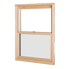
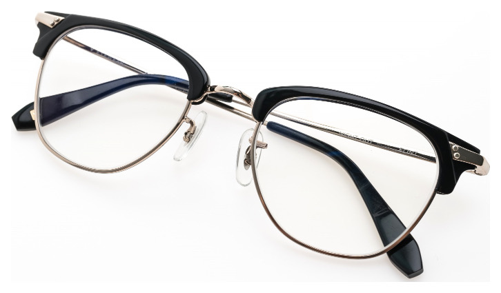
We needed to review what we'd heard from users directly: people only made contact with us when four things were true. The price was in the ballpark. The product was right. We provided evidence we were trustworthy. And we responded fast to project submissions. Budget Bill needed the comparison. Hillary needed to know she wasn't being set up. Neither of them needed a quiz about their favorite hardware finish.
So we cut it to two decisions: window style, then material. The backend couldn't calculate an exact price at that stage, so instead of a dollar figure we showed a range, high end to low end. Two clicks in, people had their ballpark budget question answered. Take away the complexity, show people what their budget actually gets them, then let them decide.
The next version dropped the illustration and put the tool directly into Renoviso's real product chrome: material and style choices with prices attached at every step, a running total in the sidebar that updated as you chose. Users could see the cost of a decision the moment they made it.


Style, then material with real prices attached, then price tier, ending on a single recommendation screen.
The final version added another path for the experts in the room: narrow down by brand, by a price-range slider, or by talking to a live person. It ended on a single recommendation screen: a best match and an alternate, each with the specs that mattered (warranty, energy rating, customization options) and an installed price attached.
Because windows was our highest-volume business, in both project configuration and overall sales, we treated the rollout as high risk: launched to a narrow set of search keywords first, A/B tested several rounds of the landing experience, and only routed all non-branded search traffic to Help Me Choose once the numbers held up.
Results
Users completing product customization increased by more than 50%. No exaggeration. People who configured their project through Help Me Choose checked out at a 10% higher rate than people who went through the traditional browse-and-configure path. We continued sending more and more direct traffic from paid search as the results improved.
Bounce rate and step-by-step progression were harder to isolate. Traffic volume was low relative to the industry, and it kept shifting under us. We grew from Boston only to all of Massachusetts, then into the New York and Philadelphia metros. Individual tests still needed weeks to reach statistical significance, so if one looked unsuccessful early, we'd pull it and give more time to whatever was trending successful. I'd rather say that than pretend the data was tidier than it was.
We kept going. Six more months of conversion-focused A/B testing after launch added another 36% on top of what Help Me Choose had already delivered.
What was clean, from the start: nobody wanted to discover their window aesthetic. They wanted to know what they could afford. Once we asked that instead, they bought windows, but not through rose-colored glasses.